Thinking ‘ink’
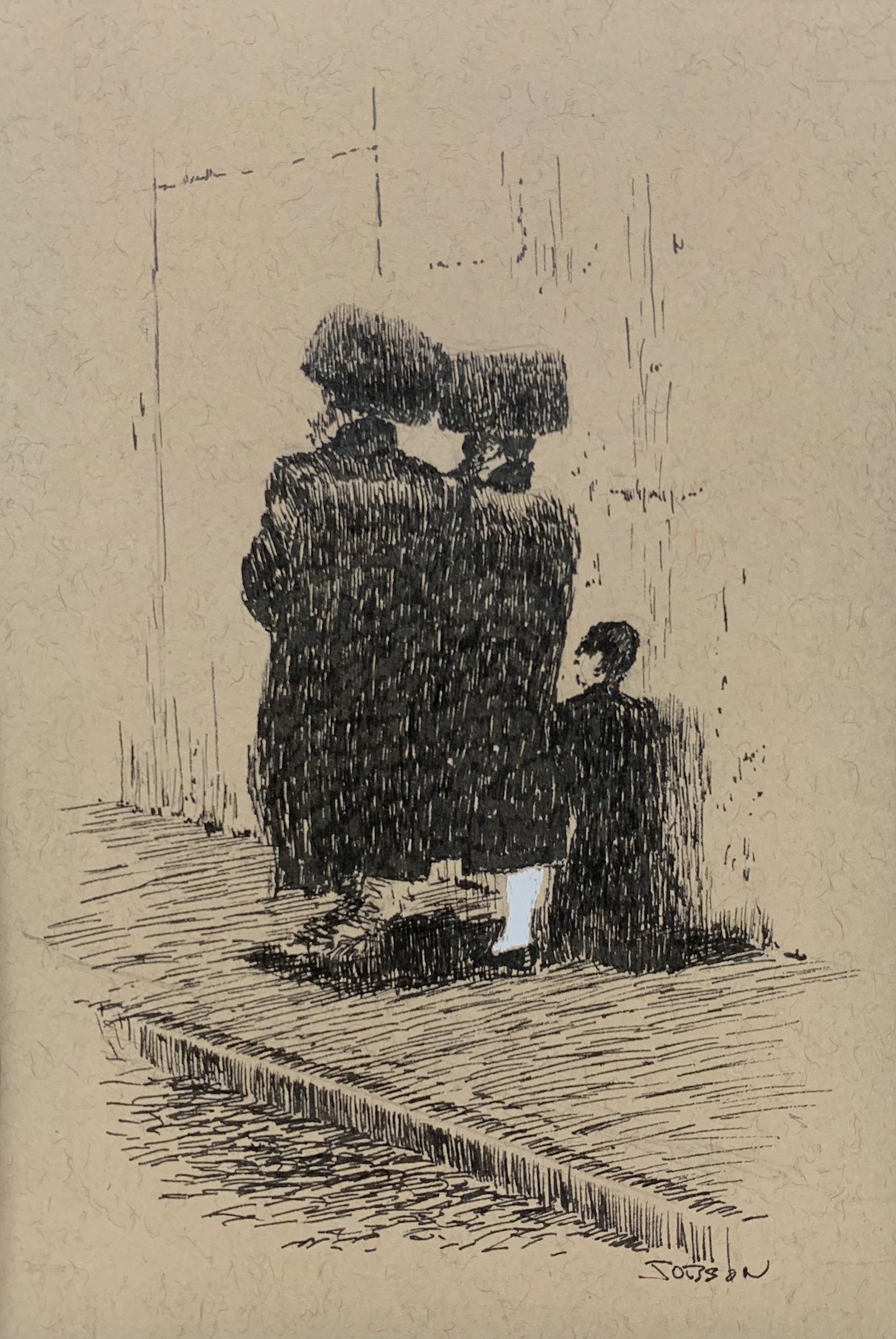
Williamsburg as an ink exercise
Pen and ink has been a lifelong interest and something I occasionally revisit. The origins go back to childhood drawing with a ballpoint pen on mom’s scrap typing paper. I loved dashing out the scenes. No need to struggle with colors or messy wet mediums. Bolder than graphite. Strictly black and white.
I loved the etched illustrations by John Leech for Dickens’ A Christmas Carol and wanted to imitate the line work. I would eventually learn of other great pen artists—Richard Goodhue, Martin Rico, Joseph Pennell—and many other draftsmen of the early 20th century, whose skills were needed in illustrating in many cases where photography could not be adequately reproduced.
I picked up a copy of Pen Drawing: An Illustrated Treatise by Charles D. Maginnis, from 1921 which contains valuable technique instruction as well as examples of various applications and styles.
I applied some of what I learned to a couple of pieces I had already done as large scale paintings. I felt they had features which would come across well in this strictly black line world. One is Williamsburg. On that particular piece I drew on toned paper, and used white ink to emphasize a feature which stands out in the composition. Not strictly a classic line exercise, but as I had no printing press limits against me, I had that freedom.
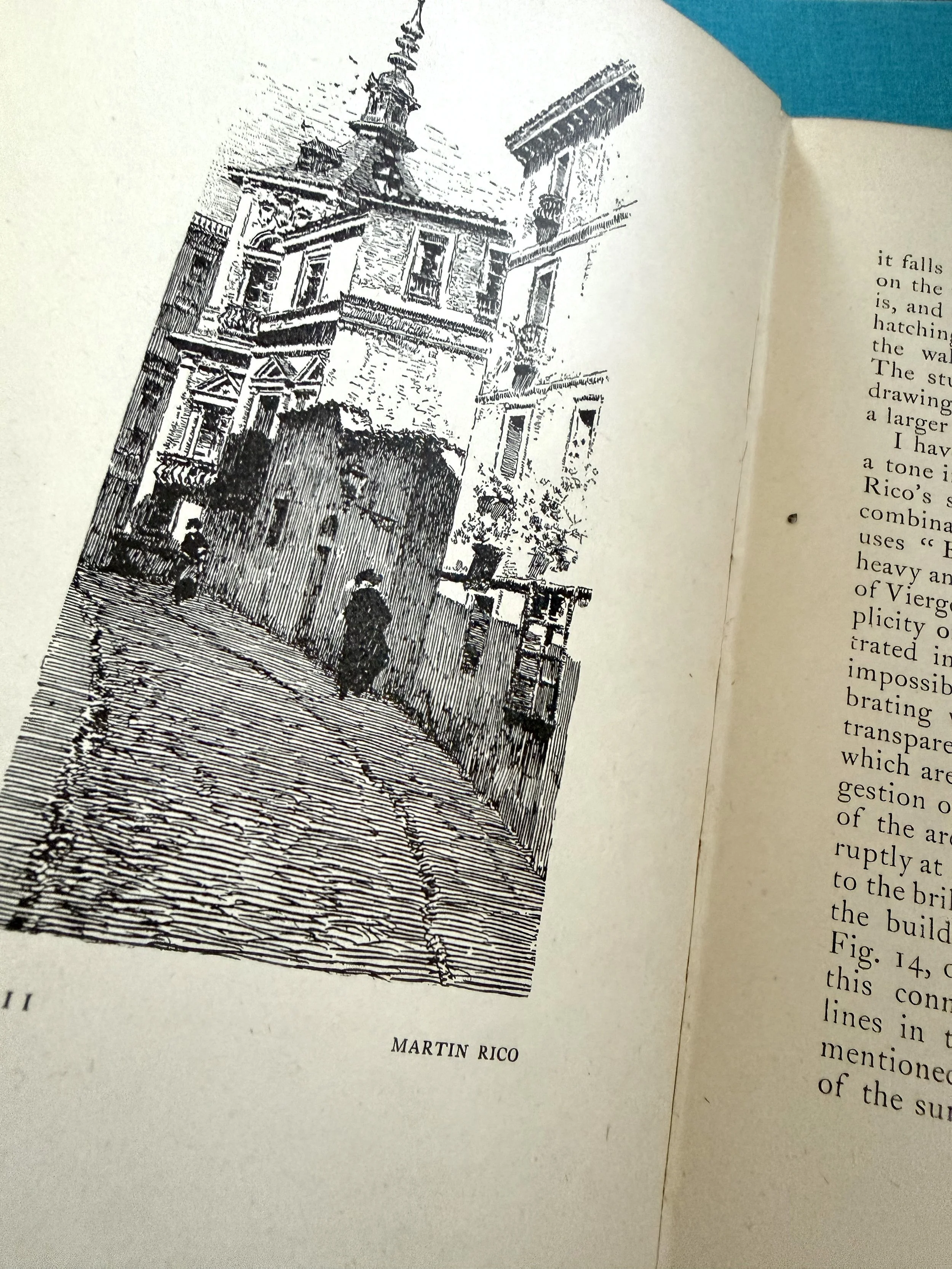
From the Charles D. Maginnis book Pen Drawing: An Illustrated Treatise
